Audience & User Research, Behaviour-Change Design, Product Design, Native app design

UX/UI Design.

Health & Wellbeing QLD: Podsquad

A gamified wellbeing platform designed to help children build healthy, lasting habits around eating, movement and sleep, developed for Health and Wellbeing Queensland.

Illustration of shells

The Challenge

Business goal: Health and Wellbeing Queensland, a prevention-focused agency, engaged Khemistry to translate a Queensland Government–backed initiative into a world-class digital program tailored to one of the most challenging audiences to design for: children.

​

User problem: In 2022, Health and Wellbeing Queensland commissioned nation-first research with a confronting finding — children born this decade could have shorter lives than their parents due to obesity, with inaction potentially costing the state $87 billion over the next decade. Health and Wellbeing Queensland is working alongside government, sectors and communities to shift the systems that make it harder for children to maintain a healthy weight. Podsquad plays an important role in supporting that work, helping build a healthier future for Queensland kids.

​

Why it was hard: Most children are already spending time on apps, so the goal wasn't to compete for attention but to redirect existing engagement toward something genuinely positive. The client's initially recommended age range was also very broad, which made designing a single, coherent experience difficult from the outset.
Cut side view of the inner system of a shell

Research & Discovery

Methods: Six discovery workshops with subject matter experts, covering audience, product and industry analysis, feature and content strategy, and the development of frameworks and experience maps.

​

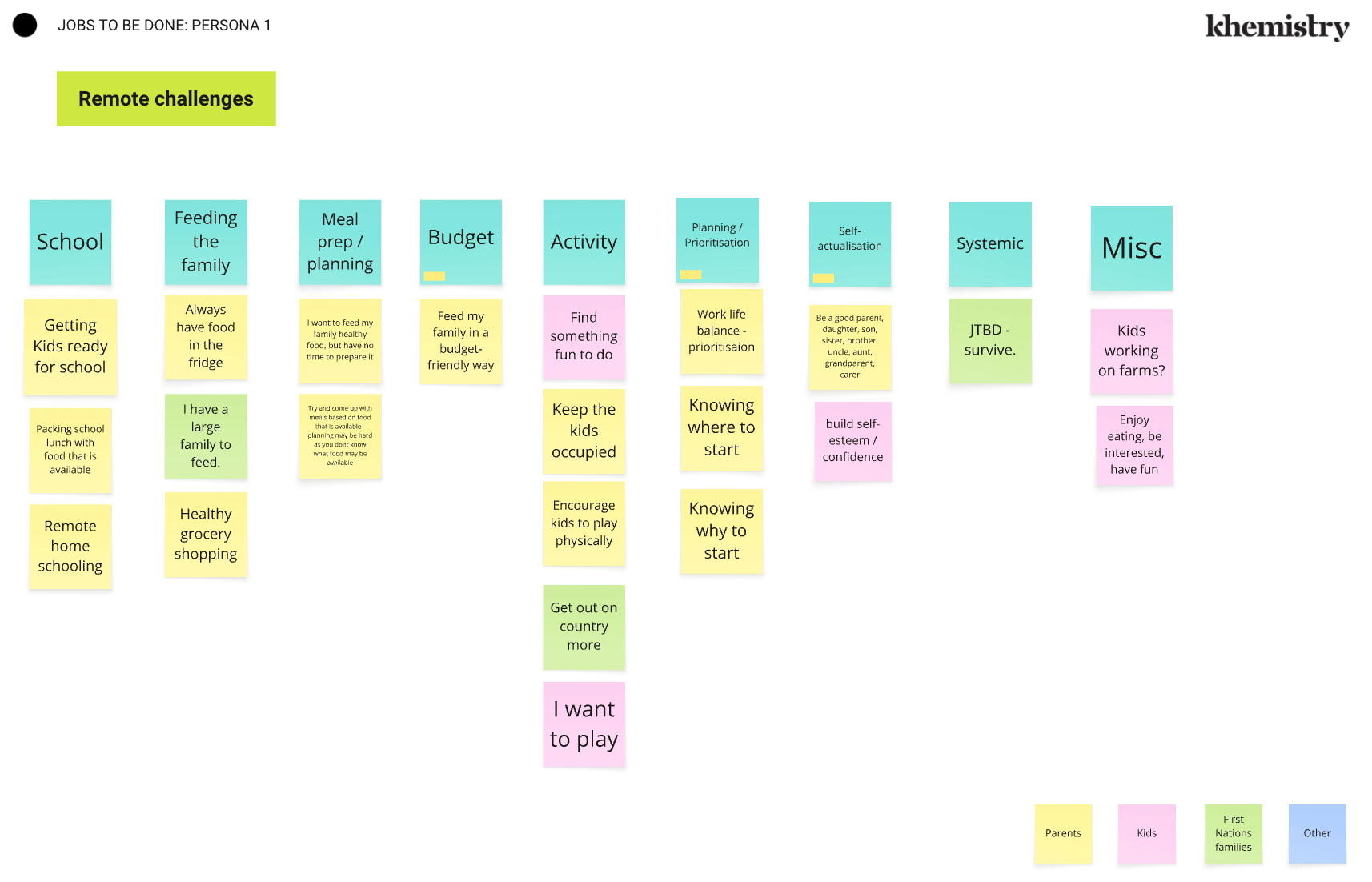
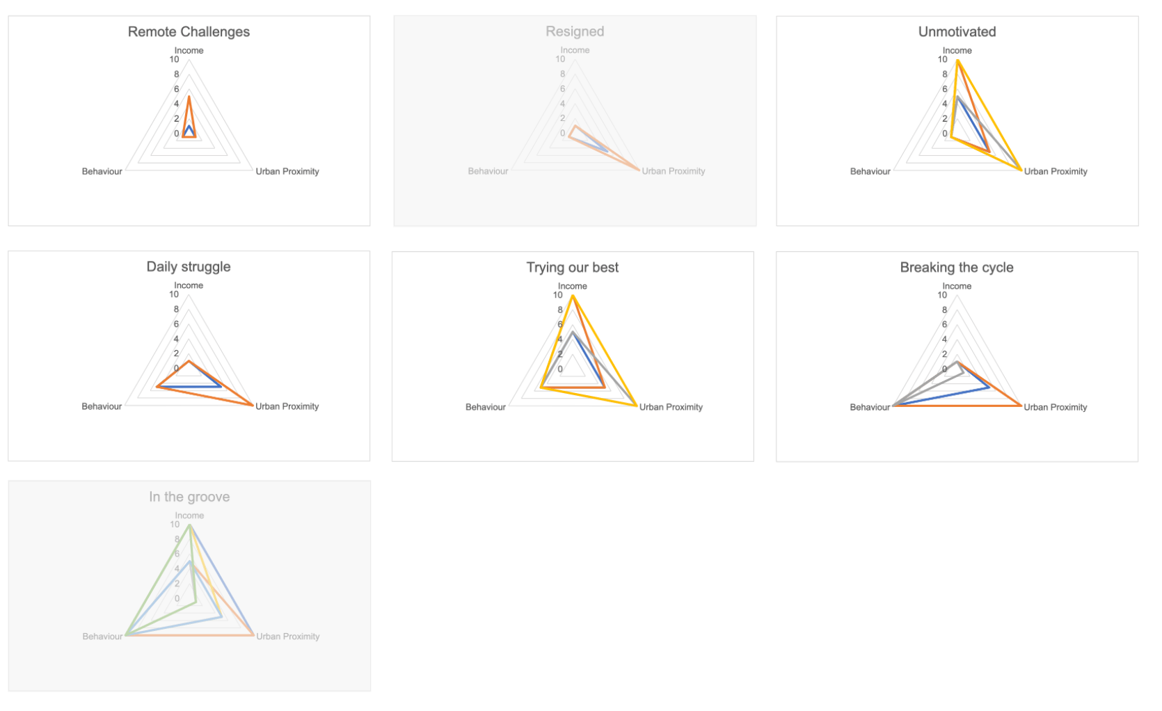
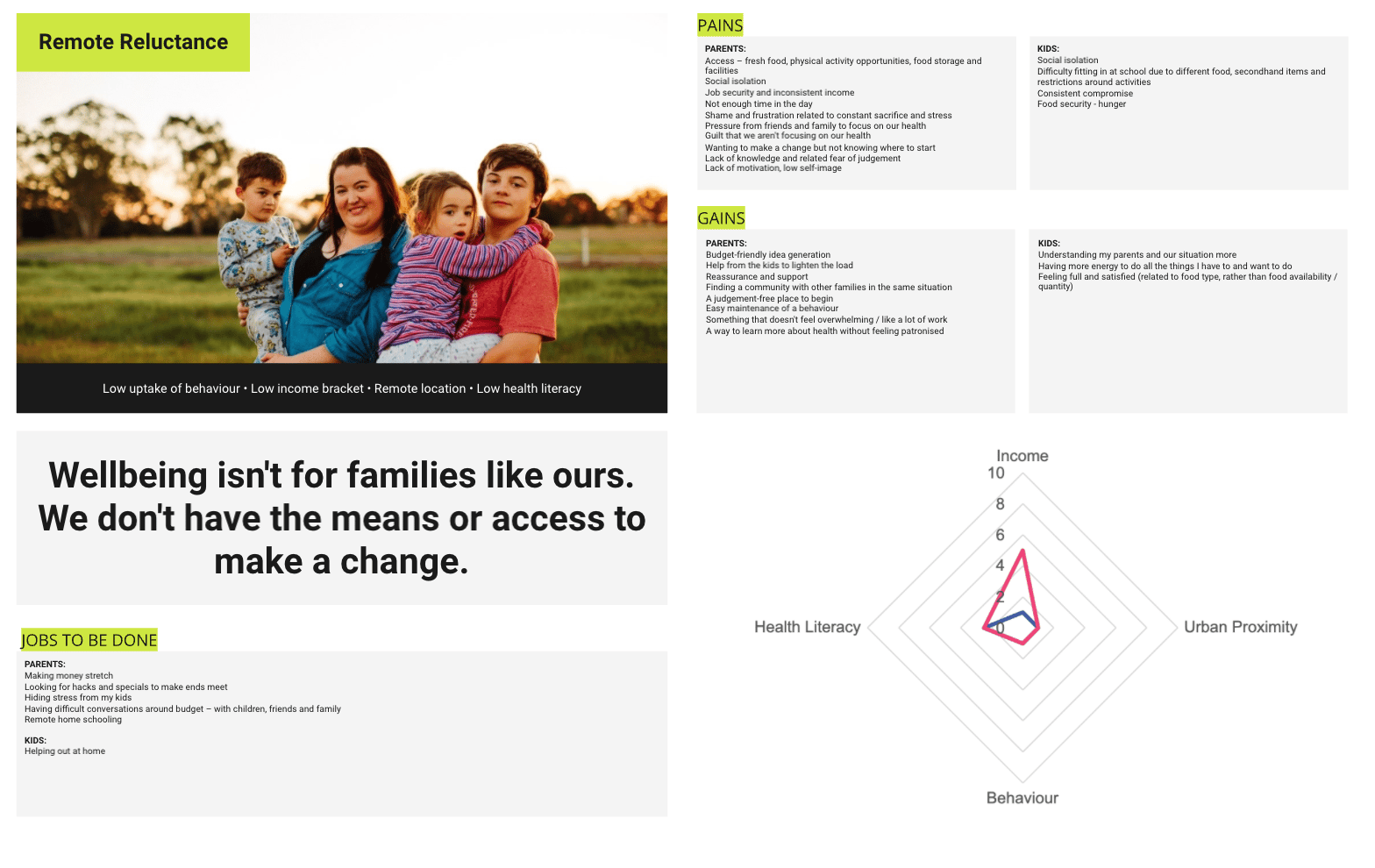
Proto-persona methodology: Using three key scoring factors, we generated 27 potential audience profiles and grouped them into mutually exclusive, collectively exhaustive segments. We also applied health literacy levels as an additional layer across each segment, to help explain likely drivers of behaviour uptake — for example, distinguishing a motivation gap from an education or attitude gap.

After synthesising themes from the audience workshops, we confirmed the primary audience as children aged 5–12. With that clarity, I developed a structured data model defining the core program modules and mapping potential content formats — forming the foundation for the platform's overall delivery approach.

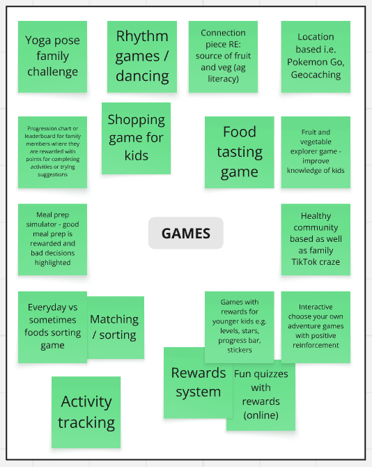
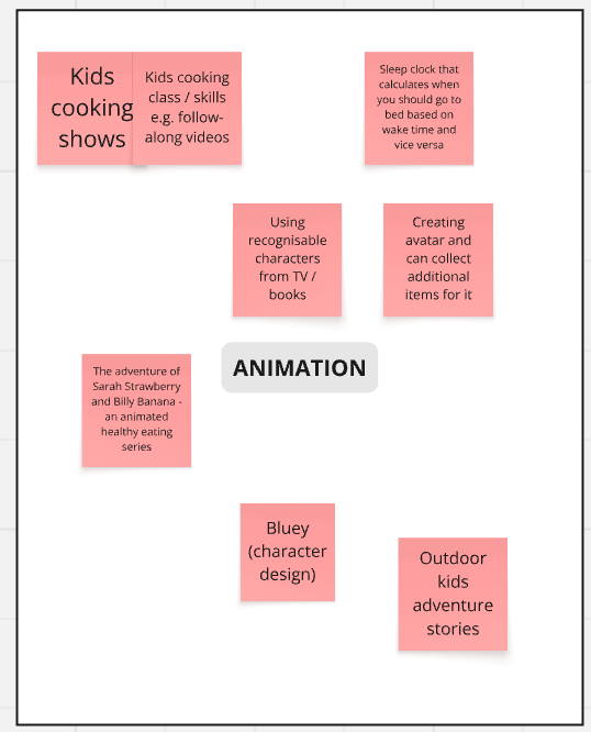
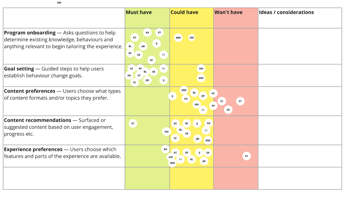
Platform features & content strategy: Through a dedicated workshop, I built consensus on how we might solve the key challenges and deliver the experience, allowing for a blended approach across different elements of the program structure. Activities included structure spectrums and feature exploration exercises.

The map was structured across three layers:

​

  • Kids' journey — the child-facing flow from onboarding through to ongoing engagement.
  • Parents' journey — set-up, supervision, goal-setting and support behaviours.
  • Shared moments — key touchpoints where parent and child participate together, such as supervised activities and shared achievements.

This experience map achieved several things: it organised the workshop themes into clear stages (onboarding, customisation, exploration, activities, progress and milestones); it separated users by role, so the platform could support the distinct needs of children and parents rather than forcing a single journey; it defined a core engagement loop showing how the program sustains repeat use — moving from exploration and activities into feedback and rewards, then back into deeper engagement and progression; it mapped digital and real-world behaviours together, pairing virtual content with real-world activities designed to be completed together or supervised; and it embedded governance and safety throughout, via parental controls, preferences and involvement settings, keeping the experience age-appropriate and parent-led where needed.

Art Direction and Narrative

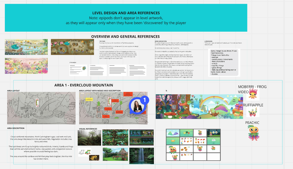
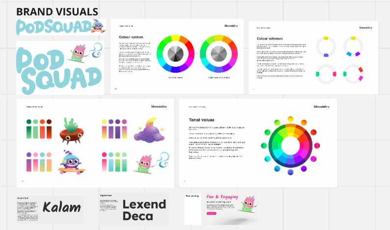
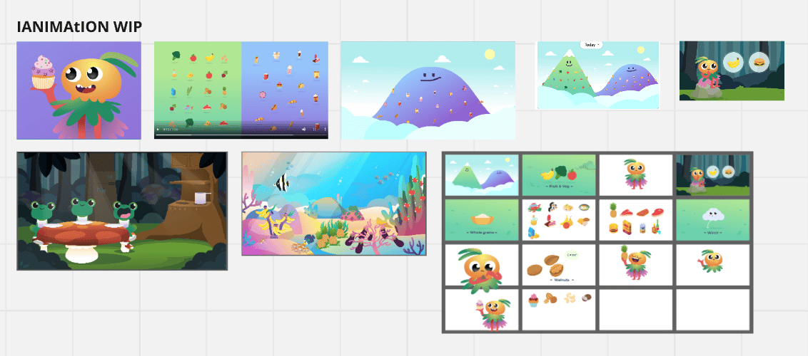
I partnered closely with the creative team to translate the experience strategy into an engaging world for children, aligning character design, animation direction and narrative with the program's behavioural goals. My role included:

​

  • Defining the narrative framework and how it supports the core loop, including where story beats introduce new modules, reinforce key messages, and reward progress
  • Providing clear character requirements based on audience insights, including age-appropriate tone, readability of expressions, diversity and relatability, and how each character functions within the learning journey
  • Mapping characters and narrative moments to specific touchpoints in the journey — onboarding, exploration, activities, feedback, milestones, and shared parent-child moments
  • Reviewing creative concepts and iterations with a UX lens, checking for clarity, emotional resonance, accessibility, and consistency with the wider product experience and content strategy
  • Collaborating on animation direction to ensure movement, pacing and visual cues supported comprehension and motivation, particularly for younger users and early readers
  • Documenting decisions and guidelines so creative outputs stayed aligned across screens, modules and future content expansion

​

Design

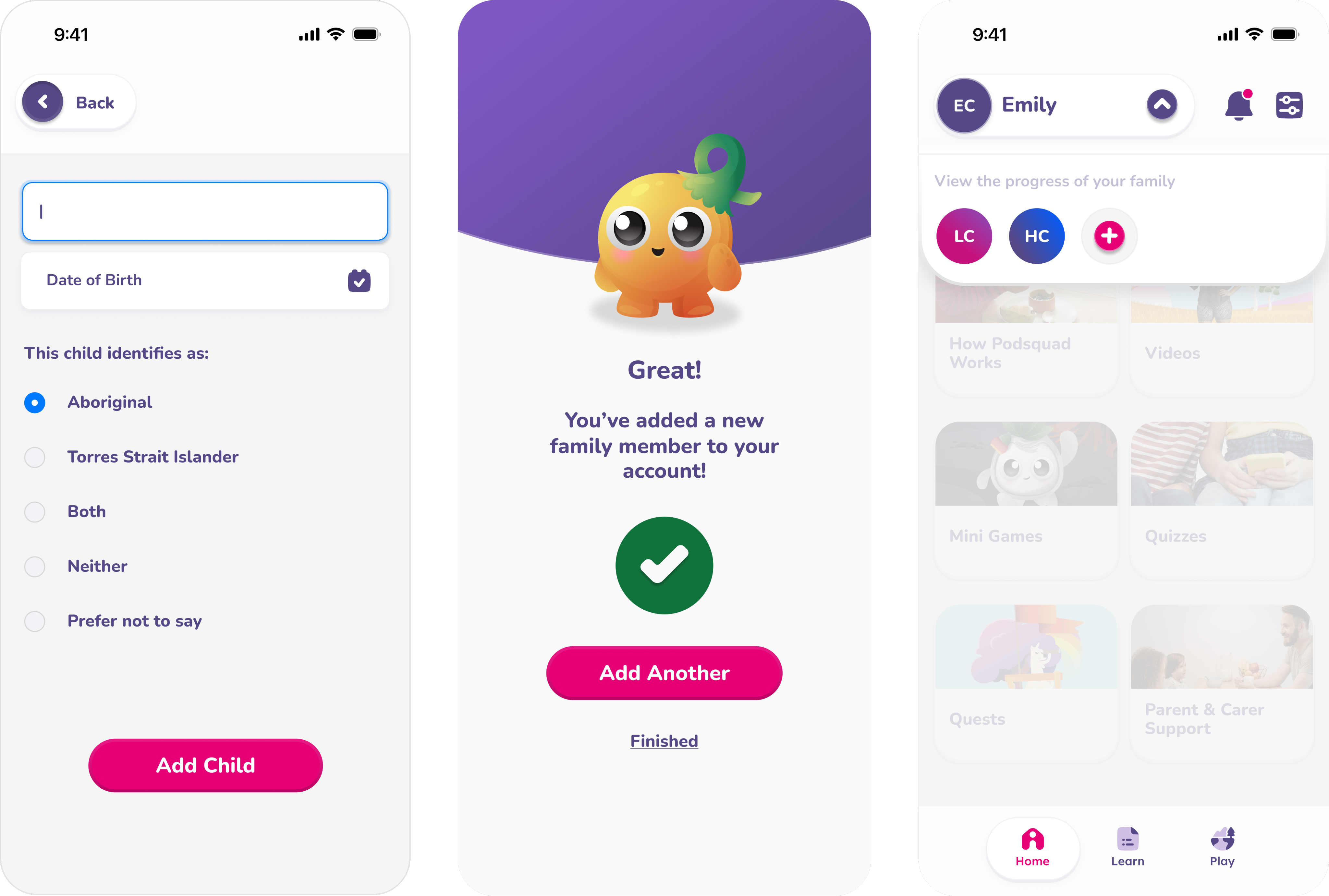
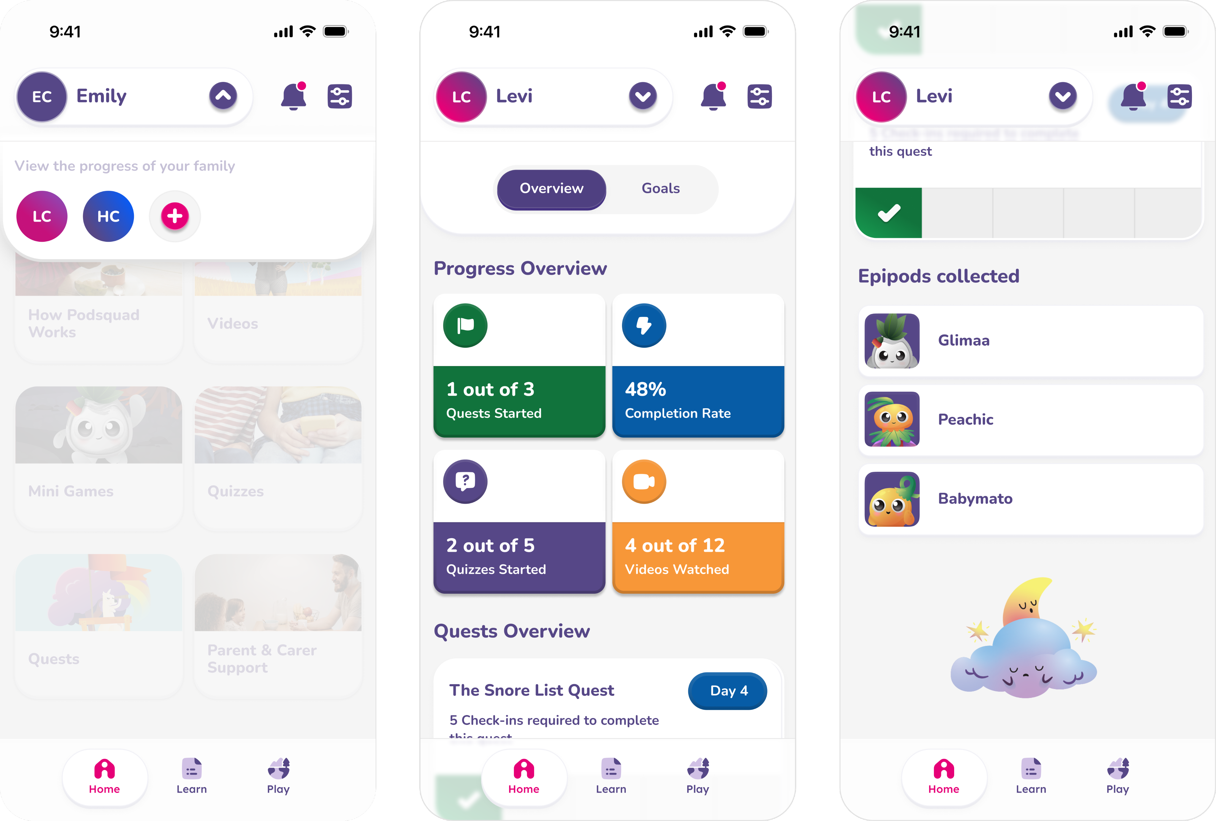
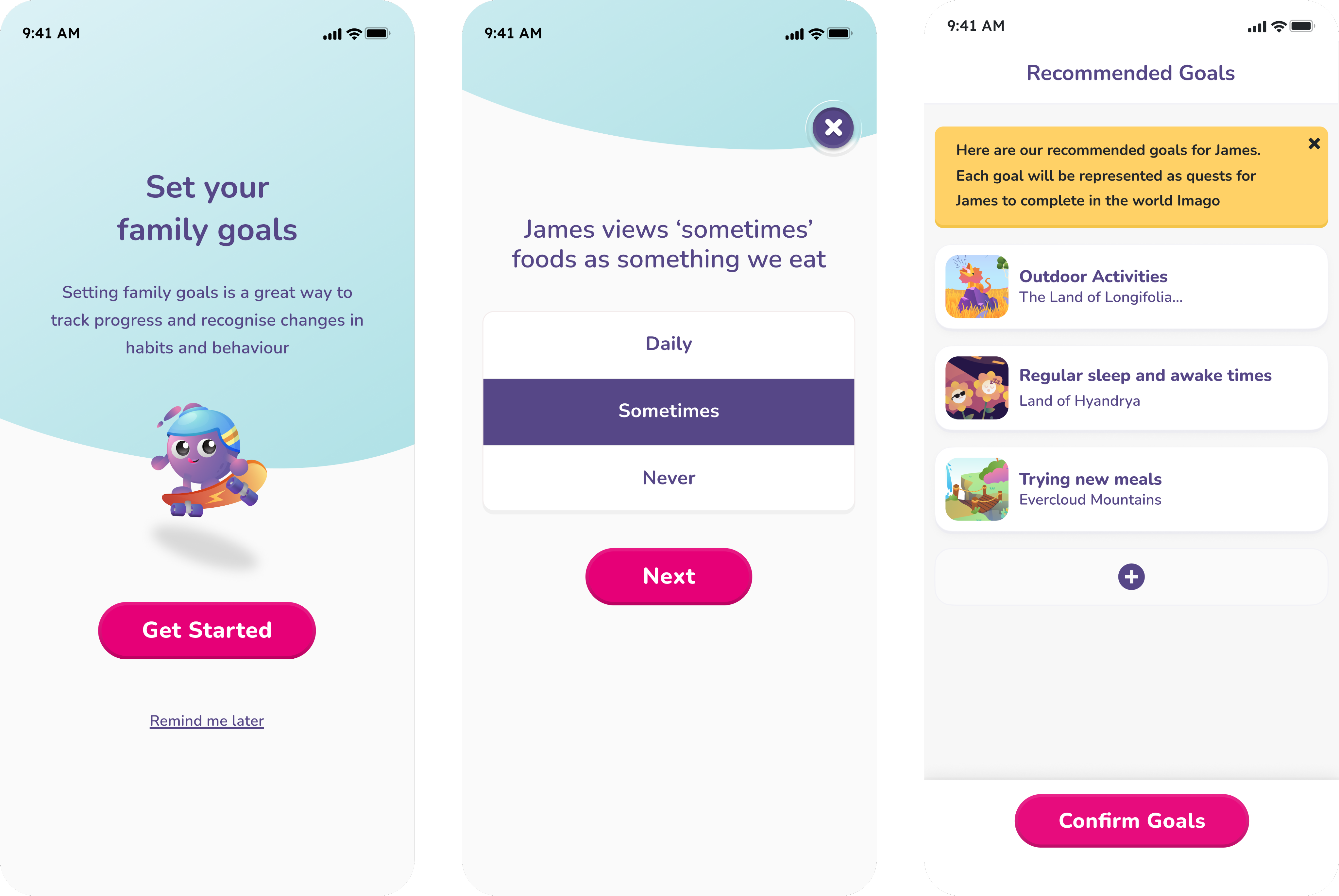
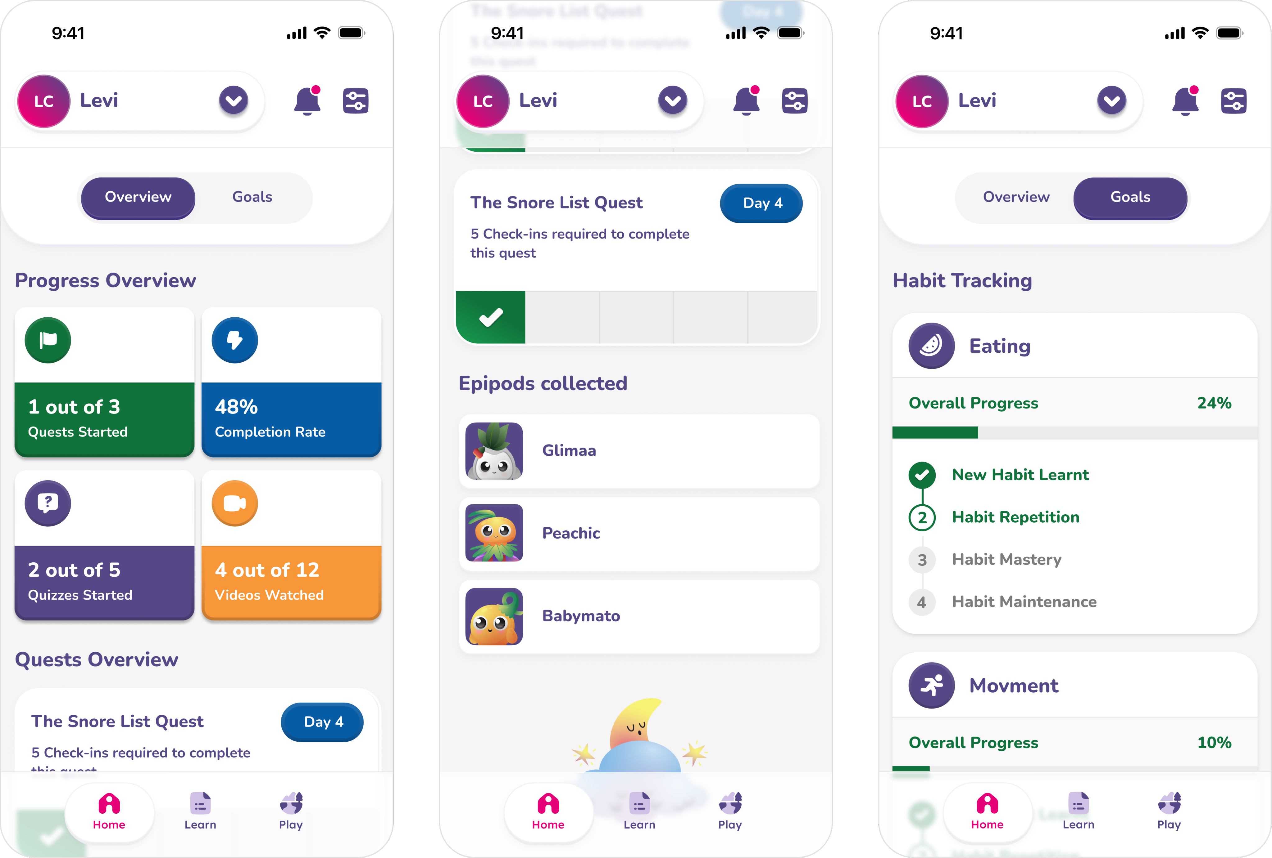
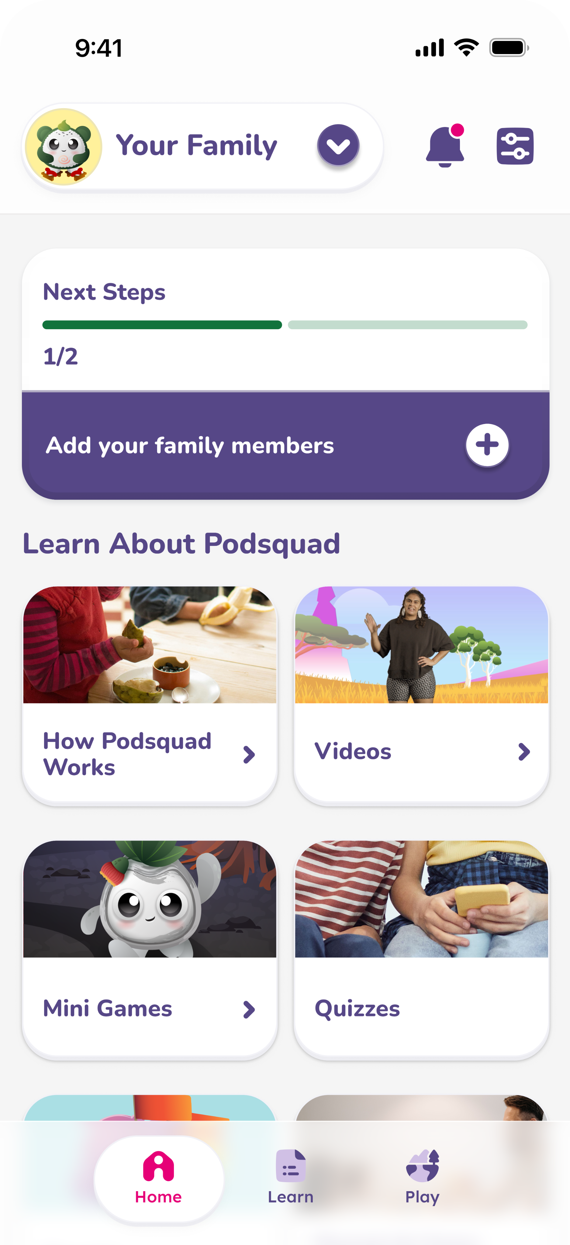
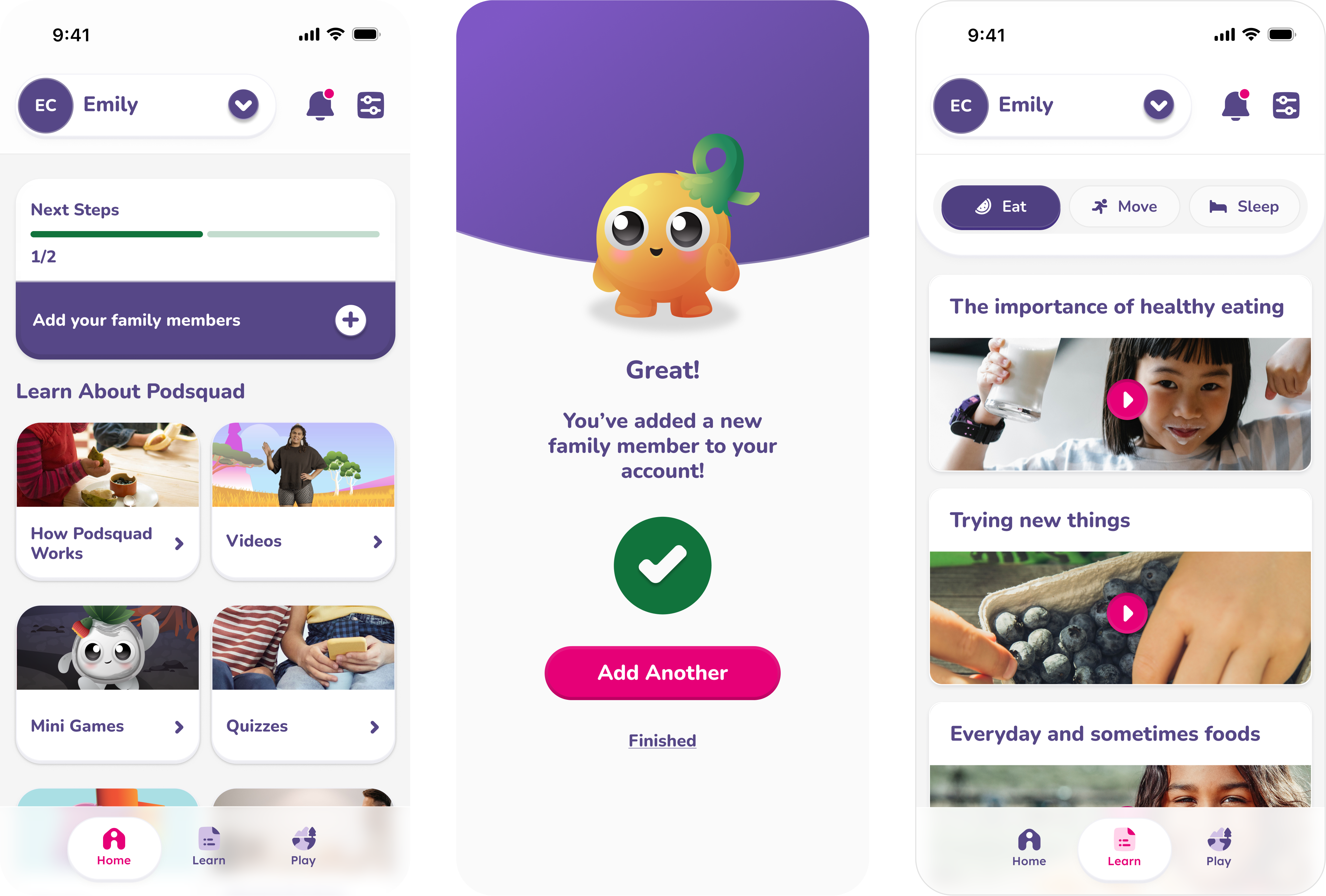
Building on the experience map, I designed user flows for both parents and children. For carers, this covered sign-up, adding family members, setting goals for their child, and a profile area where carers could track their child's progress. For children, I designed the "game" side of the experience — where the habit-forming and behaviour change actually happens, through real-life quests, collectible rewards, quizzes and games. This covered three key pillars: eating, movement and sleep, with goals set by carers aligning directly with in-game quests. The habit journey progressed through four stages: new habit, habit repetition, habit mastery, and habit maintenance.

Illustration of shells

Key flows designed or adjusted as a result of testing included navigation improvements, quest visibility, rewards and progression mechanics, and the carer-side onboarding and progress dashboard.

Reflection::

With more time, I'd have pushed back on the broad 5–12 age range earlier. Testing later confirmed what that breadth cost us — a five-year-old and an eleven-year-old need different pacing, rewards and narrative tone, and some of the progression issues we found likely stemmed from that compromise rather than the mechanics themselves. Splitting the experience into two age bands from the outset would have served both groups better.

I'd also bring parents into the loop sooner. Carer engagement lagged behind children's in testing, which limited how well the habit-forming mechanics worked, since several quests relied on reinforcement at home. The carer experience deserved the same design attention as the kids' side, not a supervision tool bolted on afterward.

Above all, this project reinforced that behaviour-change design depends as much on the people around the user as the user themselves.

For those curious about exploring or making change to their alcohol and other drug use.

Alcohol and Drug information services: Online intervention tool

Read Case Study

Simplifying a complex customer experience across multiple business units.

Lendlease: Customer Experience Blueprint

Read Case Study

Digital Customer

Experience Blueprint

Audience & User Research, Behaviour-Change Design, Product Design, Native app design

UX/UI Design.

Health & Wellbeing QLD: Podsquad

A gamified wellbeing platform designed to help children build healthy, lasting habits around eating, movement and sleep, developed for Health and Wellbeing Queensland.

Illustration of shells

The Challenge

Business goal: Health and Wellbeing Queensland, a prevention-focused agency, engaged Khemistry to translate a Queensland Government–backed initiative into a world-class digital program tailored to one of the most challenging audiences to design for: children.

​

User problem: In 2022, Health and Wellbeing Queensland commissioned nation-first research with a confronting finding — children born this decade could have shorter lives than their parents due to obesity, with inaction potentially costing the state $87 billion over the next decade. Health and Wellbeing Queensland is working alongside government, sectors and communities to shift the systems that make it harder for children to maintain a healthy weight. Podsquad plays an important role in supporting that work, helping build a healthier future for Queensland kids.

​

Why it was hard: Most children are already spending time on apps, so the goal wasn't to compete for attention but to redirect existing engagement toward something genuinely positive. The client's initially recommended age range was also very broad, which made designing a single, coherent experience difficult from the outset.
Cut side view of the inner system of a shell

Research & Discovery

Methods: Six discovery workshops with subject matter experts, covering audience, product and industry analysis, feature and content strategy, and the development of frameworks and experience maps.

Proto-persona methodology: Using three key scoring factors, we generated 27 potential audience profiles and grouped them into mutually exclusive, collectively exhaustive segments. We also applied health literacy levels as an additional layer across each segment, to help explain likely drivers of behaviour uptake — for example, distinguishing a motivation gap from an education or attitude gap.

After synthesising themes from the audience workshops, we confirmed the primary audience as children aged 5–12. With that clarity, I developed a structured data model defining the core program modules and mapping potential content formats — forming the foundation for the platform's overall delivery approach.

Platform features & content strategy: Through a dedicated workshop, I built consensus on how we might solve the key challenges and deliver the experience, allowing for a blended approach across different elements of the program structure. Activities included structure spectrums and feature exploration exercises.

The map was structured across three layers:

​

  • Kids' journey — the child-facing flow from onboarding through to ongoing engagement.
  • Parents' journey — set-up, supervision, goal-setting and support behaviours.
  • Shared moments — key touchpoints where parent and child participate together, such as supervised activities and shared achievements.

Fig. : Screen capture from MIRO

This experience map achieved several things: it organised the workshop themes into clear stages (onboarding, customisation, exploration, activities, progress and milestones); it separated users by role, so the platform could support the distinct needs of children and parents rather than forcing a single journey; it defined a core engagement loop showing how the program sustains repeat use — moving from exploration and activities into feedback and rewards, then back into deeper engagement and progression; it mapped digital and real-world behaviours together, pairing virtual content with real-world activities designed to be completed together or supervised; and it embedded governance and safety throughout, via parental controls, preferences and involvement settings, keeping the experience age-appropriate and parent-led where needed.

Art Direction and Narrative

I partnered closely with the creative team to translate the experience strategy into an engaging world for children, aligning character design, animation direction and narrative with the program's behavioural goals. My role included:

​

  • Defining the narrative framework and how it supports the core loop, including where story beats introduce new modules, reinforce key messages, and reward progress
  • Providing clear character requirements based on audience insights, including age-appropriate tone, readability of expressions, diversity and relatability, and how each character functions within the learning journey
  • Mapping characters and narrative moments to specific touchpoints in the journey — onboarding, exploration, activities, feedback, milestones, and shared parent-child moments
  • Reviewing creative concepts and iterations with a UX lens, checking for clarity, emotional resonance, accessibility, and consistency with the wider product experience and content strategy
  • Collaborating on animation direction to ensure movement, pacing and visual cues supported comprehension and motivation, particularly for younger users and early readers
  • Documenting decisions and guidelines so creative outputs stayed aligned across screens, modules and future content expansion

​

Design

Building on the experience map, I designed user flows for both parents and children. For carers, this covered sign-up, adding family members, setting goals for their child, and a profile area where carers could track their child's progress. For children, I designed the "game" side of the experience — where the habit-forming and behaviour change actually happens, through real-life quests, collectible rewards, quizzes and games. This covered three key pillars: eating, movement and sleep, with goals set by carers aligning directly with in-game quests. The habit journey progressed through four stages: new habit, habit repetition, habit mastery, and habit maintenance.

Illustration of shells

Testing & Validation

Building on the experience map, I designed user flows for both parents and children. For carers, this covered sign-up, adding family members, setting goals for their child, and a profile area where carers could track their child's progress. For children, I designed the "game" side of the experience — where the habit-forming and behaviour change actually happens, through real-life quests, collectible rewards, quizzes and games. This covered three key pillars: eating, movement and sleep, with goals set by carers aligning directly with in-game quests. The habit journey progressed through four stages: new habit, habit repetition, habit mastery, and habit maintenance.

​

Consultation goals:

  • Validate assumptions and learn more about audience needs
  • Understand whether the planned topics were useful and desirable
  • Test content for comprehension, effectiveness and engagement
  • Uncover insights into language, messaging and cultural sensitivities
  • Test the usability and accessibility of the design

​

The plan also included QA testing and content review to confirm the product worked as intended, both technically and functionally, alongside a final content review with internal stakeholders and relevant SMEs.

Key flows designed or adjusted as a result of testing included navigation improvements, quest visibility, rewards and progression mechanics, and the carer-side onboarding and progress dashboard.

Reflection:

With more time, I'd have pushed back on the broad 5–12 age range earlier. Testing later confirmed what that breadth cost us — a five-year-old and an eleven-year-old need different pacing, rewards and narrative tone, and some of the progression issues we found likely stemmed from that compromise rather than the mechanics themselves. Splitting the experience into two age bands from the outset would have served both groups better.

​

I'd also bring parents into the loop sooner. Carer engagement lagged behind children's in testing, which limited how well the habit-forming mechanics worked, since several quests relied on reinforcement at home. The carer experience deserved the same design attention as the kids' side, not a supervision tool bolted on afterward.

​

Above all, this project reinforced that behaviour-change design depends as much on the people around the user as the user themselves.

For those curious about exploring or making change to their alcohol and other drug use.

Alcohol and Drug information services: Online intervention tool

Read Case Study

Simplifying a complex customer experience across multiple business units.

Lendlease: Customer Experience Blueprint

Read Case Study

Digital Customer

Experience Blueprint

Audience & User Research, Behaviour-Change Design, Product Design, Native app design

UX/UI Design.

Health & Wellbeing QLD: Podsquad

A gamified wellbeing platform designed to help children build healthy, lasting habits around eating, movement and sleep, developed for Health and Wellbeing Queensland.

Illustration of shells

The Challenge

Business goal: Health and Wellbeing Queensland, a prevention-focused agency, engaged Khemistry to translate a Queensland Government–backed initiative into a world-class digital program tailored to one of the most challenging audiences to design for: children.

​

​

User problem: In 2022, Health and Wellbeing Queensland commissioned nation-first research with a confronting finding — children born this decade could have shorter lives than their parents due to obesity, with inaction potentially costing the state $87 billion over the next decade. Health and Wellbeing Queensland is working alongside government, sectors and communities to shift the systems that make it harder for children to maintain a healthy weight. Podsquad plays an important role in supporting that work, helping build a healthier future for Queensland kids.

​

Why it was hard: Most children are already spending time on apps, so the goal wasn't to compete for attention but to redirect existing engagement toward something genuinely positive. The client's initially recommended age range was also very broad, which made designing a single, coherent experience difficult from the outset.
Cut side view of the inner system of a shell

Research & Discovery

Methods: Six discovery workshops with subject matter experts, covering audience, product and industry analysis, feature and content strategy, and the development of frameworks and experience maps.

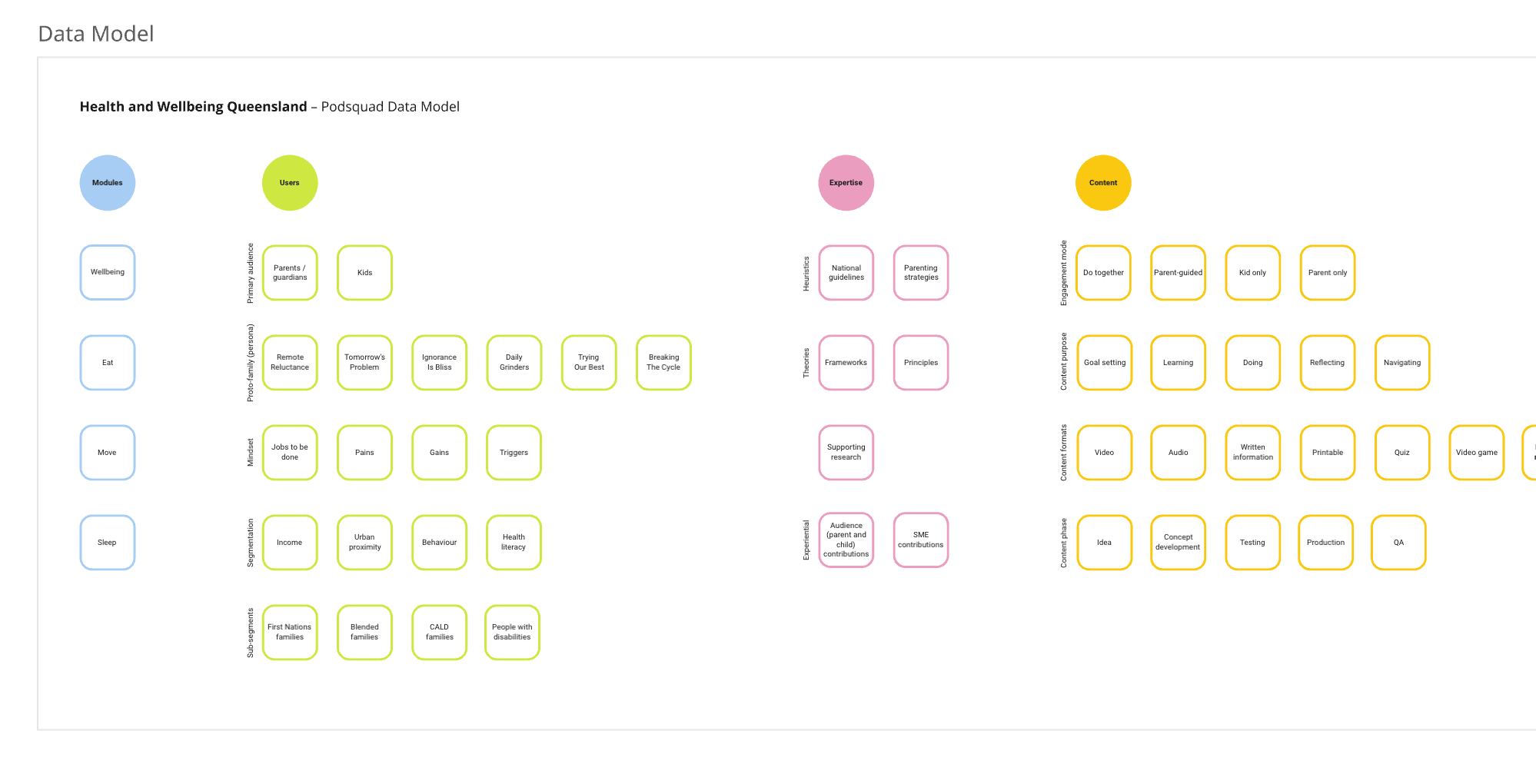
Proto-persona methodology: Using three key scoring factors, we generated 27 potential audience profiles and grouped them into mutually exclusive, collectively exhaustive segments. We also applied health literacy levels as an additional layer across each segment, to help explain likely drivers of behaviour uptake — for example, distinguishing a motivation gap from an education or attitude gap.

After synthesising themes from the audience workshops, we confirmed the primary audience as children aged 5–12. With that clarity, I developed a structured data model defining the core program modules and mapping potential content formats — forming the foundation for the platform's overall delivery approach.
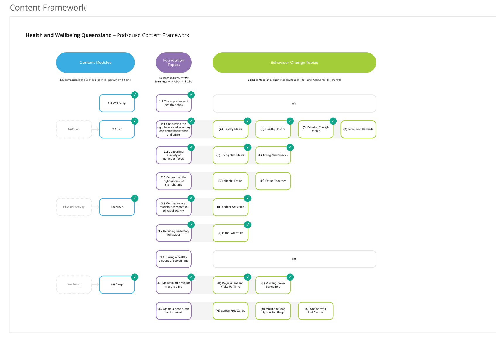
Platform features & content strategy: Through a dedicated workshop, I built consensus on how we might solve the key challenges and deliver the experience, allowing for a blended approach across different elements of the program structure. Activities included structure spectrums and feature exploration exercises.

Experience map: To translate the workshop insights into a tangible product direction, I created an experience map visualising the end-to-end journey for both children and parents, and how their interactions connect over time.

​

The map was structured across three layers:

​

  • Kids' journey — the child-facing flow from onboarding through to ongoing engagement.
  • Parents' journey — set-up, supervision, goal-setting and support behaviours.
  • Shared moments — key touchpoints where parent and child participate together, such as supervised activities and shared achievements.
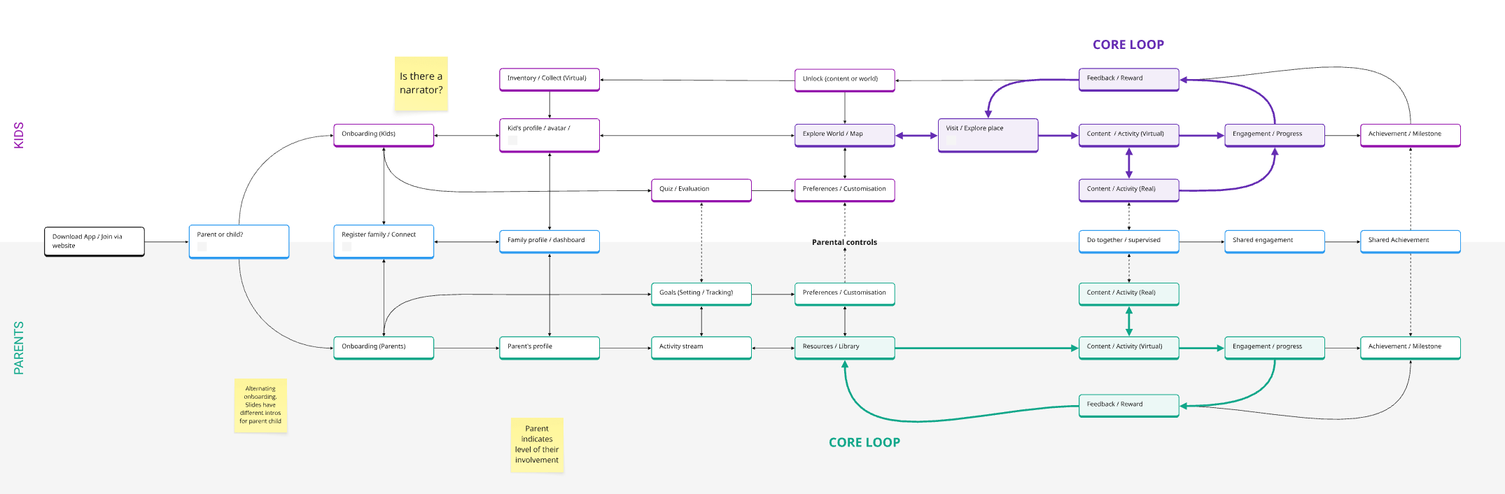
Fig. : Screen capture from MIRO

This experience map achieved several things: it organised the workshop themes into clear stages (onboarding, customisation, exploration, activities, progress and milestones); it separated users by role, so the platform could support the distinct needs of children and parents rather than forcing a single journey; it defined a core engagement loop showing how the program sustains repeat use — moving from exploration and activities into feedback and rewards, then back into deeper engagement and progression; it mapped digital and real-world behaviours together, pairing virtual content with real-world activities designed to be completed together or supervised; and it embedded governance and safety throughout, via parental controls, preferences and involvement settings, keeping the experience age-appropriate and parent-led where needed.
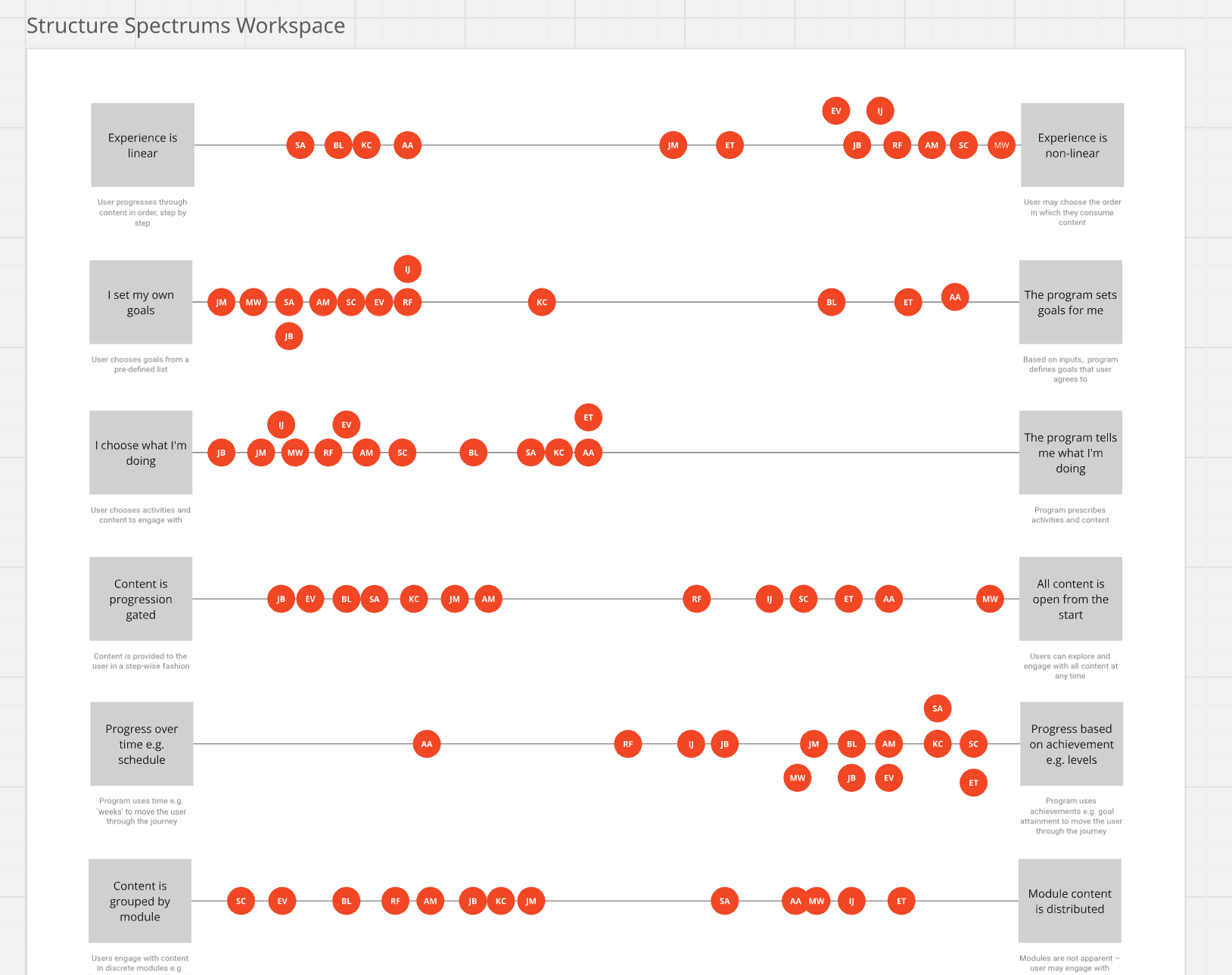
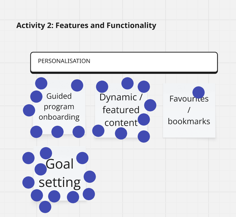
Fig. : Screen capture from MIRO

Art Direction and Narrative

I partnered closely with the creative team to translate the experience strategy into an engaging world for children, aligning character design, animation direction and narrative with the program's behavioural goals. My role included:

​

  • Defining the narrative framework and how it supports the core loop, including where story beats introduce new modules, reinforce key messages, and reward progress
  • Providing clear character requirements based on audience insights, including age-appropriate tone, readability of expressions, diversity and relatability, and how each character functions within the learning journey
  • Mapping characters and narrative moments to specific touchpoints in the journey — onboarding, exploration, activities, feedback, milestones, and shared parent-child moments
  • Reviewing creative concepts and iterations with a UX lens, checking for clarity, emotional resonance, accessibility, and consistency with the wider product experience and content strategy
  • Collaborating on animation direction to ensure movement, pacing and visual cues supported comprehension and motivation, particularly for younger users and early readers
  • Documenting decisions and guidelines so creative outputs stayed aligned across screens, modules and future content expansion

​

Design

Building on the experience map, I designed user flows for both parents and children. For carers, this covered sign-up, adding family members, setting goals for their child, and a profile area where carers could track their child's progress. For children, I designed the "game" side of the experience — where the habit-forming and behaviour change actually happens, through real-life quests, collectible rewards, quizzes and games. This covered three key pillars: eating, movement and sleep, with goals set by carers aligning directly with in-game quests. The habit journey progressed through four stages: new habit, habit repetition, habit mastery, and habit maintenance.

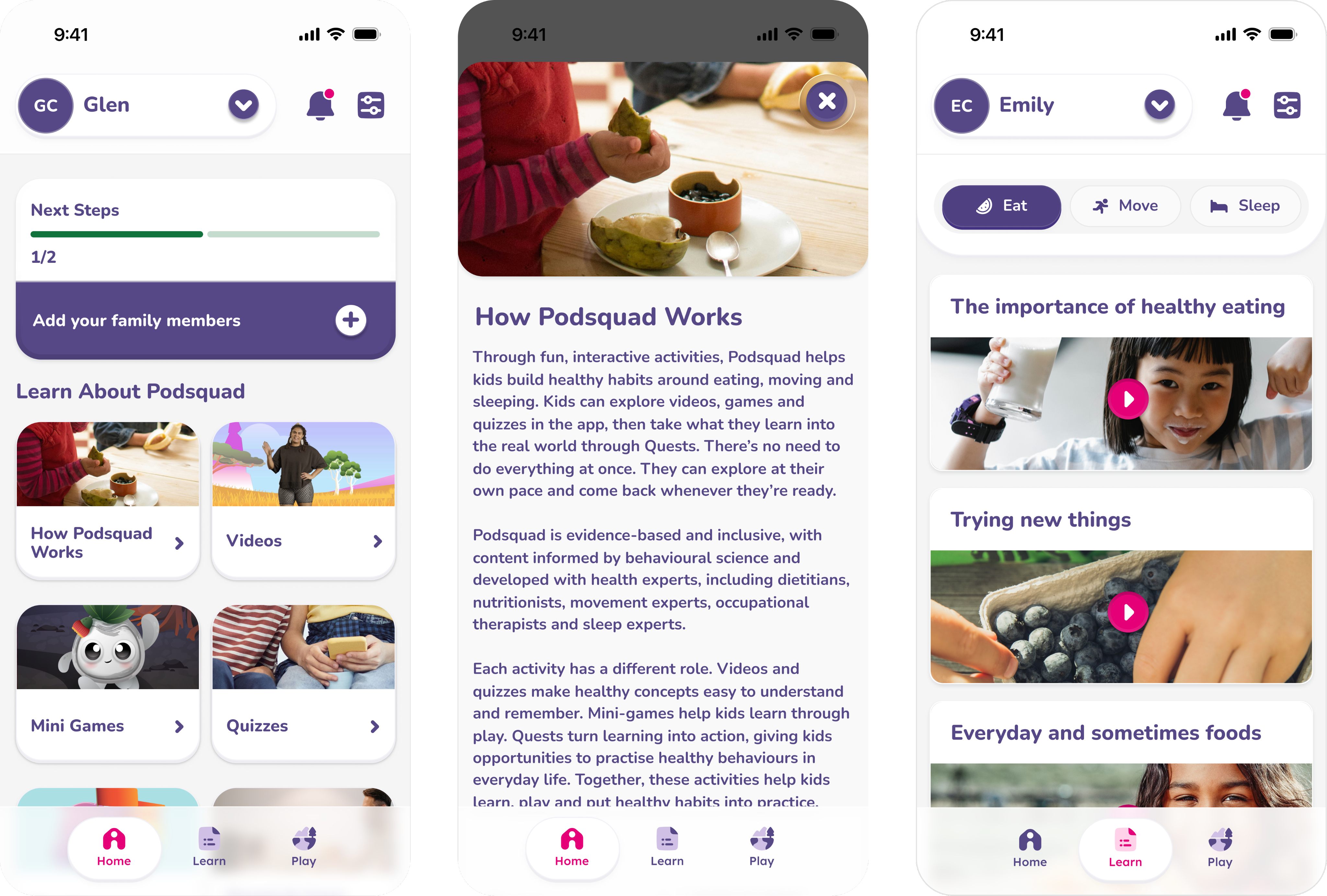
Illustration of shells

Testing & Validation

We held multiple cohort sessions with children and their carers across three different demographics in Queensland, to understand how well participants comprehended the app, how far they'd progressed, whether new habits were forming, and what they liked, disliked, and wanted to see more of.

​

This testing surfaced several gaps: children weren't progressing through the habit stages as expected; parents weren't engaging enough with the carer-side tools; and navigation issues meant quest and quiz progress wasn't always being recorded correctly.

​

In response, we ran a three-week design sprint to understand these gaps in more detail, develop solutions, and build simple prototypes of the proposed enhancements to test with the audience again. Findings were shared with the client, leading to a prioritised list of initiatives and improvements.

Key flows designed or adjusted as a result of testing included navigation improvements, quest visibility, rewards and progression mechanics, and the carer-side onboarding and progress dashboard.

Reflection::

With more time, I'd have pushed back on the broad 5–12 age range earlier. Testing later confirmed what that breadth cost us — a five-year-old and an eleven-year-old need different pacing, rewards and narrative tone, and some of the progression issues we found likely stemmed from that compromise rather than the mechanics themselves. Splitting the experience into two age bands from the outset would have served both groups better.

I'd also bring parents into the loop sooner. Carer engagement lagged behind children's in testing, which limited how well the habit-forming mechanics worked, since several quests relied on reinforcement at home. The carer experience deserved the same design attention as the kids' side, not a supervision tool bolted on afterward.

Above all, this project reinforced that behaviour-change design depends as much on the people around the user as the user themselves.

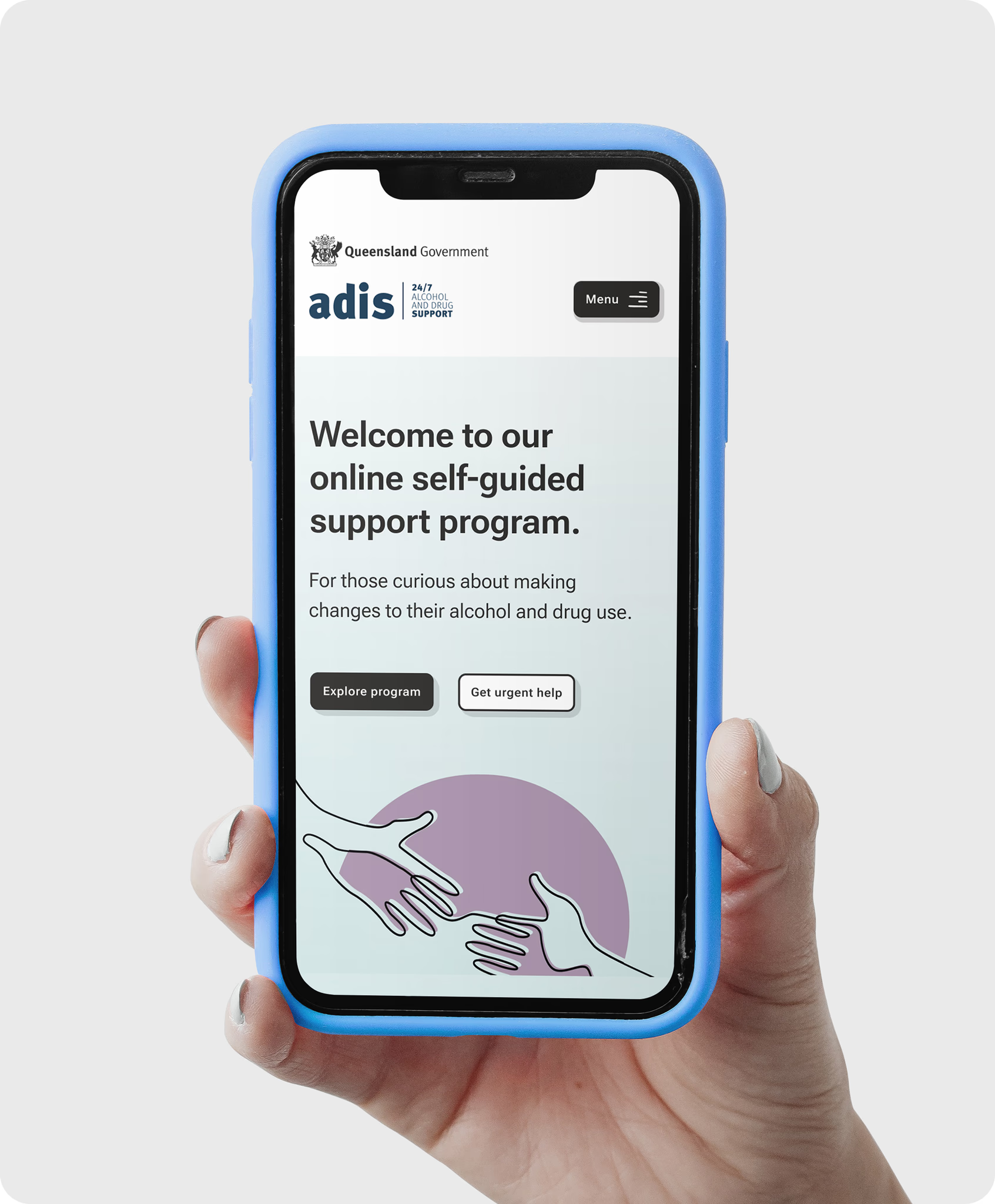
For those curious about exploring or making change to their alcohol and other drug use.

Alcohol and Drug information services: Online intervention tool

Read Case Study
Digital Customer

Experience Blueprint
Simplifying a complex customer experience across multiple business units.

Lendlease: Customer Experience Blueprint

Read Case Study